I had the pleasure of participating in Beth Spencer’s Introvert Drawing Club, a place to foster people like me to create art! Beth hosts live drawing sessions, shares her incredible sketchbook pages, and offers drawing and illustrations tips. She is such a warm, open, and kind person who is always enthusiastic about her subject matter.
This past weekend, she hosted a drawing session focused on negative space. While I couldn’t make the live session (thank you, hockey,) I eagerly watched the recorded replay and painted as my parents were over watching the U.S. Open. Since I’m a consummate multitasker, this all worked out splendidly.
The task was to focus on starting with the negative space of the images that Beth provided. I find that when I paint, I immediately get overwhelmed by the details. I commend all the artists out there who can paint photographic-like renderings. It takes a keen eye, a nimble hand and so much talent. Maybe it’s because I don’t have any of these qualities in spades, I prefer painting loose.
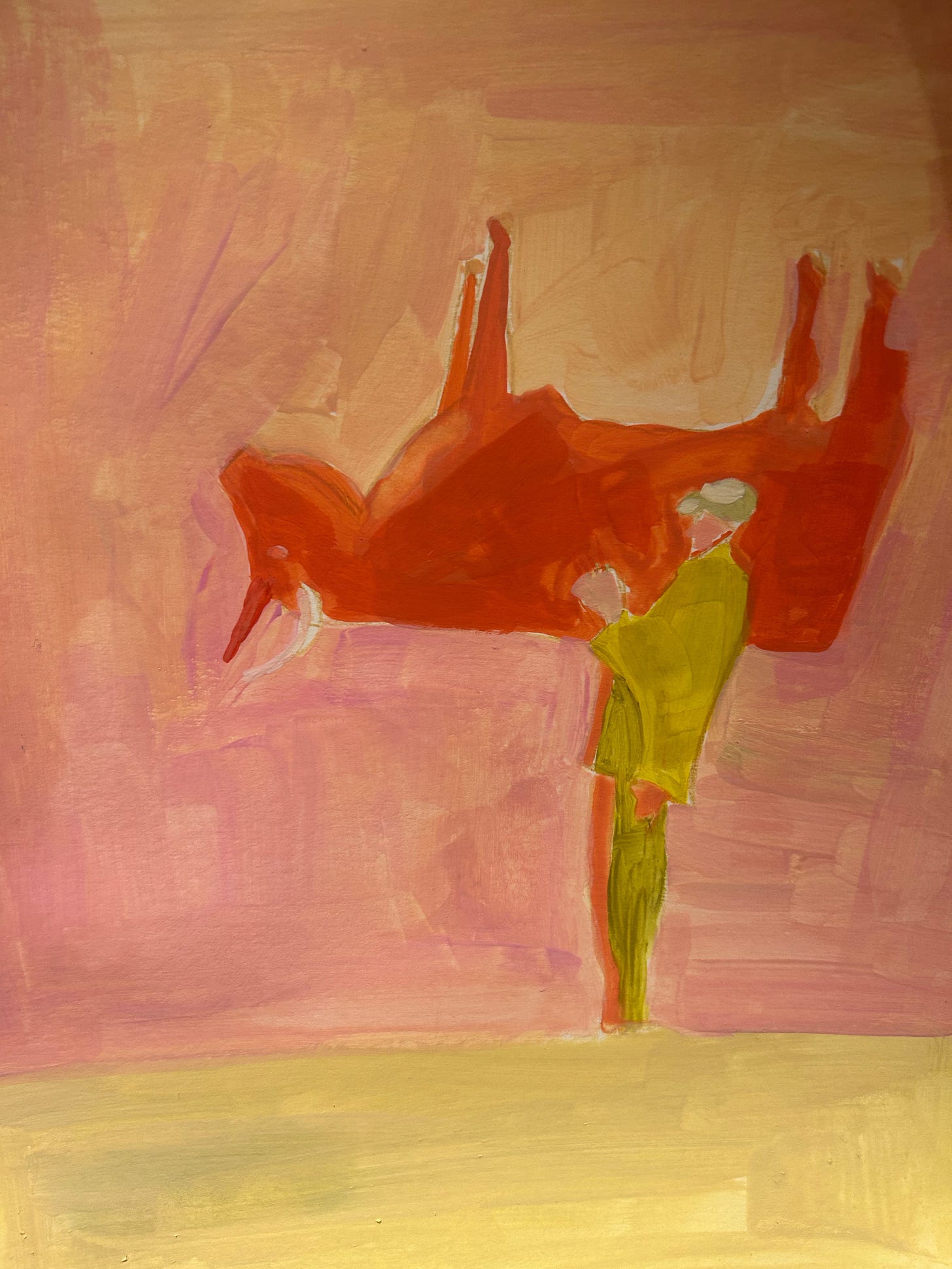
(This one ended up being my favorite. It was a black and white photo of a man carrying a cow. Where was he taking the cow? How was he lifting it up? Was it a trick of the eye? Who knows!)
So, for these images, I tried to distil them down to their basic shapes and forms and create color combinations that were interesting and complimented one another. This wasn’t quite the assignment, but it yielded results that were wholly my own.
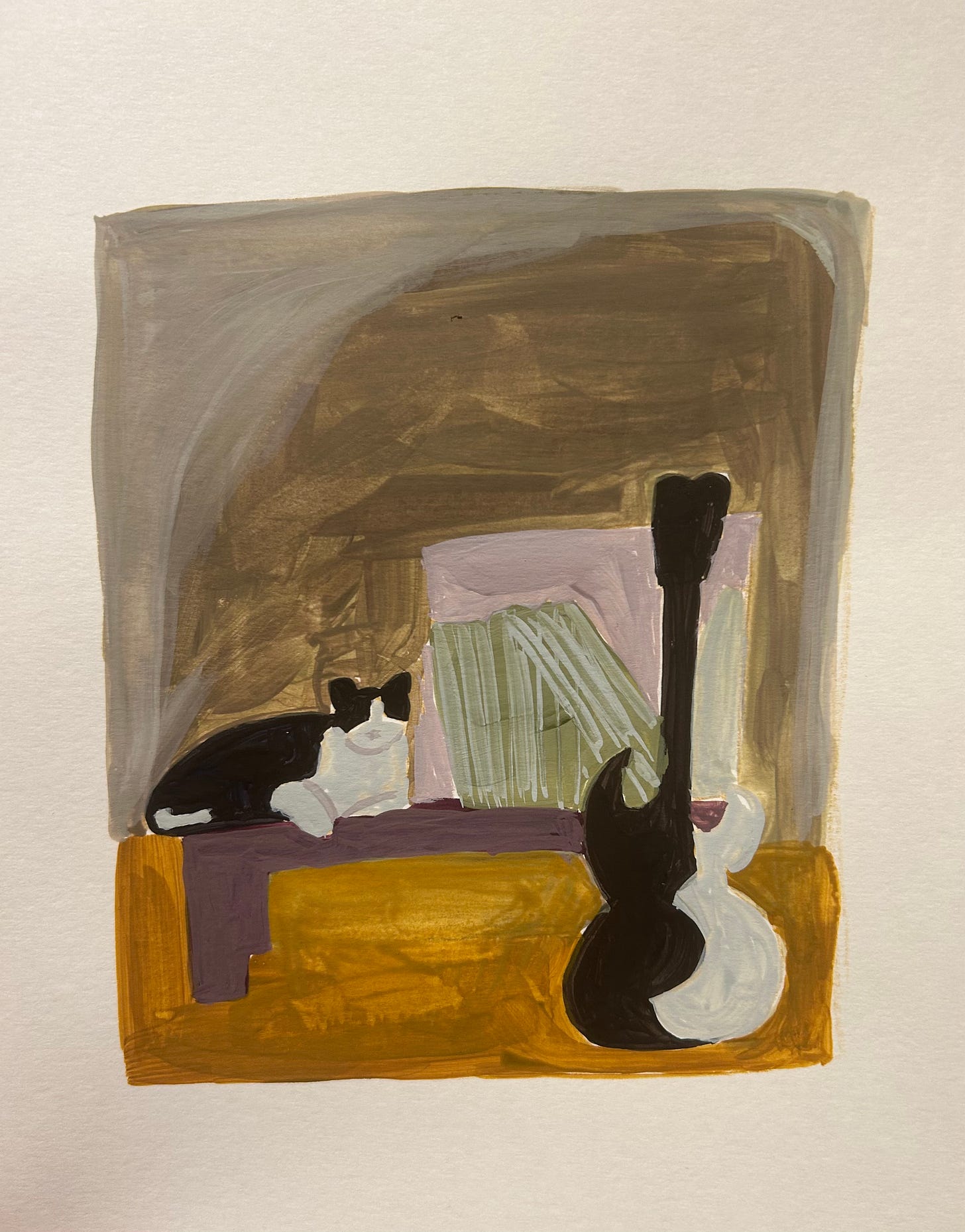
(I have a hard time free drawing straight lines, hence the wonky right side. I’m happy with the cat and the guitar - because of the color choices, it sort of looks like the guitar transformed into the cat. Those are records tilting in a crate. It was difficult to make them look like records.)
It can be challenging to find your own voice through artistic expression. Perhaps even more challenging to trust the voice that is speaking through you the loudest. Whether it’s writing or painting or whatever is your preferred medium of artistic expression it’s helpful to imitate others, at first, to dissect how they created something, but then it’s important to step back, start over and really tune in to what you want to be creating and how you want to make it wholly unique.
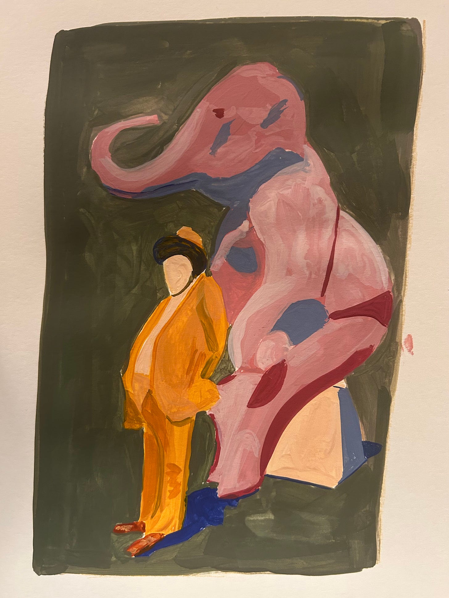
(It seems the straight line issue happens on the right side of the page. Why not use a ruler. you ask? Great idea! I am not happy with my colors in this one. I wish I’d stuck to an orange and green palette. The elephant looks like it drank too much Pepto BismoI and the shadows I added made it look like she is wearing bikini bottoms. But I think it’s important to share work I don’t like and dissect why I don’t like it so I can avoid making the same mistakes the next time.)
I often go back to the simplicity of Mr. Rogers idea of radically embracing who we are as individuals. We just need to tap in to that endless well in order to endlessly create.
Want more artistic musings? Check out my previous posts:



I’m liking what I’m seeing! Straight lines are for architects.
I have a mountain stack of replays to catch up on with Beth.
i love that guy carrying a cow - that would be a great book cover!